CSS GRID CHESSBOARD
A responsive 8×8 chessboard layout built using only HTML and CSS Grid.
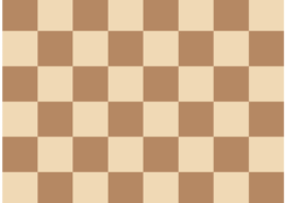
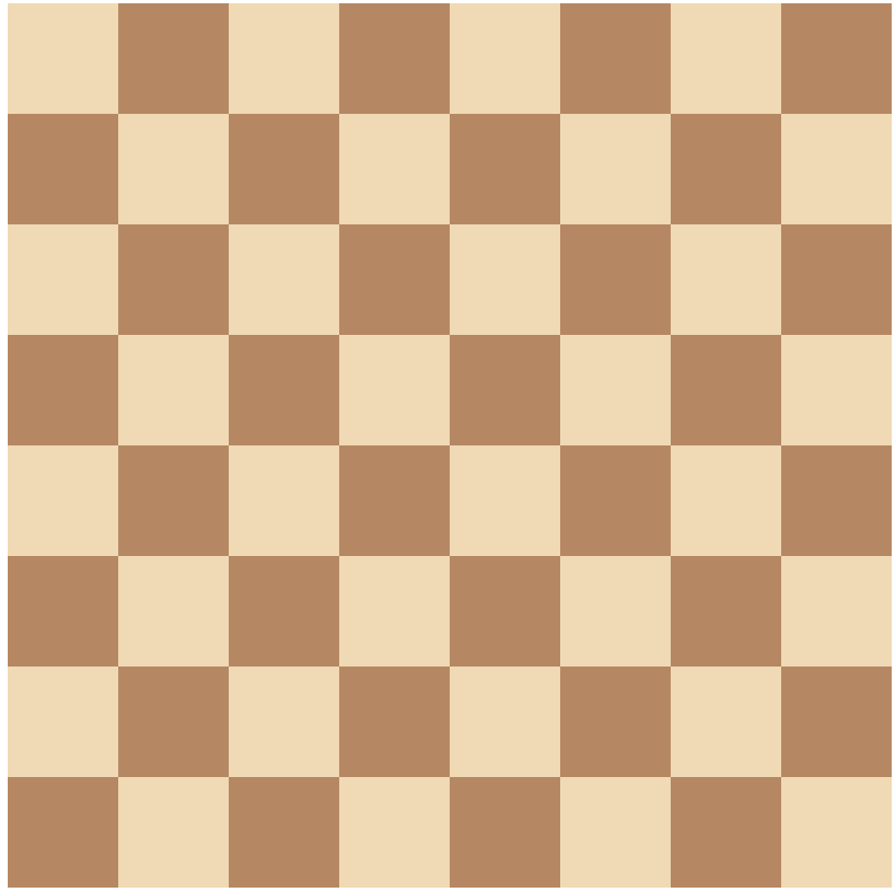
This project showcases a clean, responsive 8×8 chessboard layout built entirely with HTML and CSS Grid. It highlights the power of CSS Grid in creating structured, balanced layouts without relying on JavaScript, images, or external libraries.
Each square is styled using nth-child selectors, which create the alternating black-and-white tile pattern seen on a traditional chessboard. As a result, the design is both accurate and visually pleasing. The layout maintains symmetry using uniform rows and columns. Because of this, it adapts perfectly across screen sizes—whether on desktops, tablets, or mobile devices.
In addition, the project uses only semantic HTML and modern CSS. There are no external dependencies, making it lightweight and fast-loading. It is ideal for those learning CSS Grid or seeking to demonstrate their skills in a portfolio. It also serves as a helpful teaching tool to show how layout and structure can be achieved without complex code.
Moreover, this chessboard project proves that CSS alone can handle challenges that developers often assign to JavaScript. Transition words and logical flow have been carefully integrated to improve readability and SEO performance. Unlike some beginner examples, this version refines responsiveness and visual clarity to a higher standard.
You can enhance this project further by adding interactivity with JavaScript or including chess pieces using SVGs or icons. However, even without these features, the layout stands strong as a well-executed, professional display of frontend techniques.
To sum up, this chessboard is a strong example of clean code, thoughtful design, and practical CSS Grid implementation. Whether used for learning, inspiration, or client presentation, it delivers both function and style through core web technologies alone.
Tools Used
Features
📱Responsive Layout
Adjusts gracefully across mobile, tablet, and desktop screens.
📐 Clean Grid-based Design
Uses structured layout for easy readability and visual balance.
💻 Pure HTML & CSS (No JS)
Crafted without JavaScript for a lightweight, fast-loading experience.
What I Learned
🟫 CSS Grid Fundamentals
Learned how to use display: grid, grid-template, and gap to build structured layouts.
🧩 Pattern Creation with Selectors
Used :nth-child() pseudo-classes to create alternating tile patterns without extra markup.
📐 Cell Alignment & Layout Symmetry
Maintained uniform row and column alignment for a visually balanced grid across screen sizes.
📱 Responsive Design Techniques
Built a fully responsive layout that adapts gracefully to mobile, tablet, and desktop screens.
⚡ Lightweight, Dependency-Free Design
Focused on performance by using pure HTML and CSS, without JavaScript or external libraries.
Other Projects in This Category

Amazion Landing Page


